Tiber Typeface
(Re)drawing History
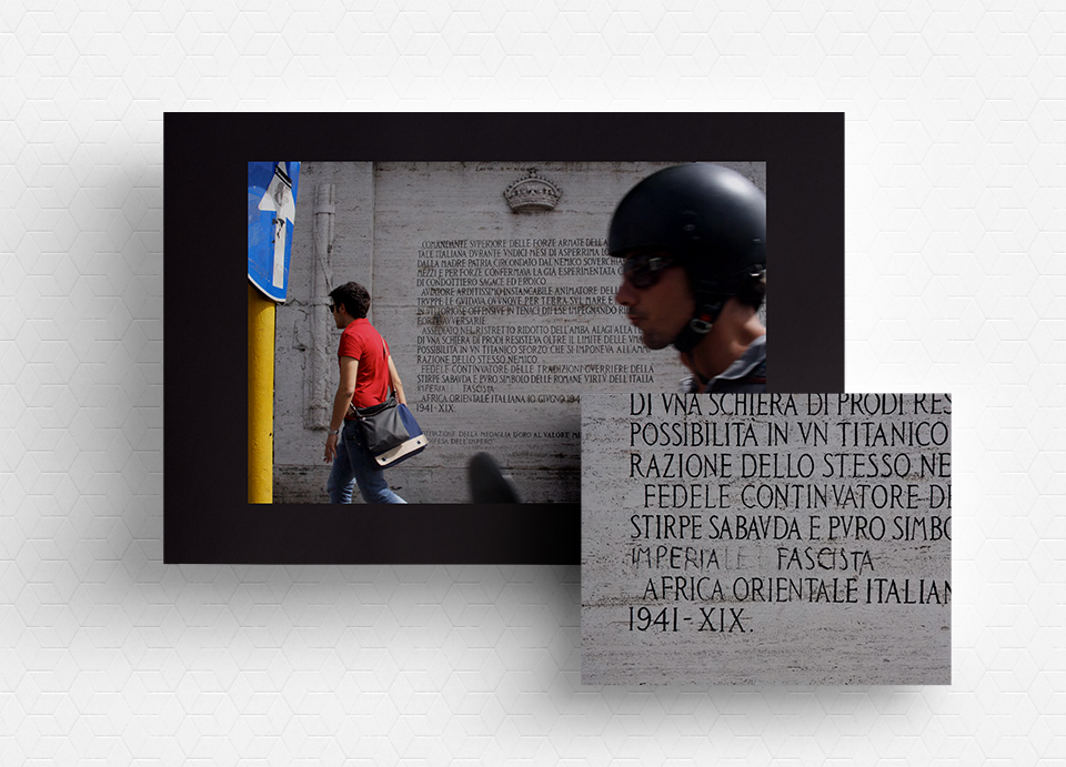
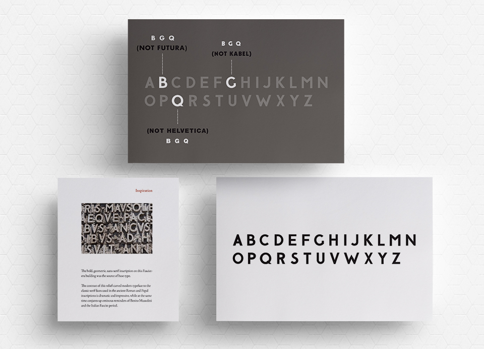
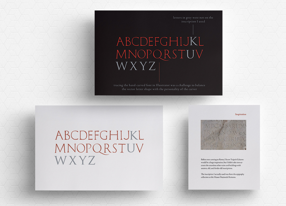
In the course of the SVA Masters Workshop in Design History, Theory and Practice in Rome and Italy, 2010, my final project was to create one digital typeface based on the typography of two engraved public inscriptions found in Rome, created about 2000 years apart.
A Serif-Sans
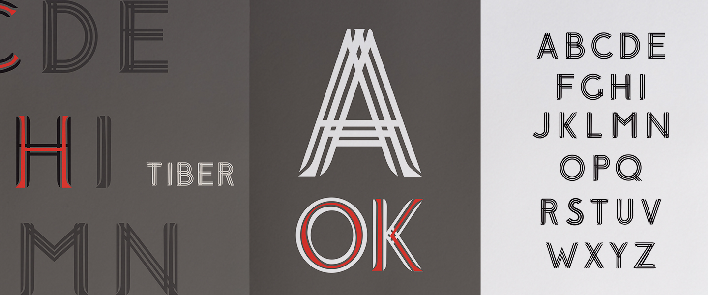
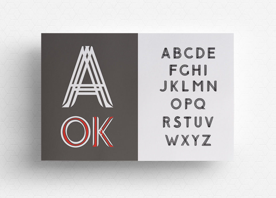
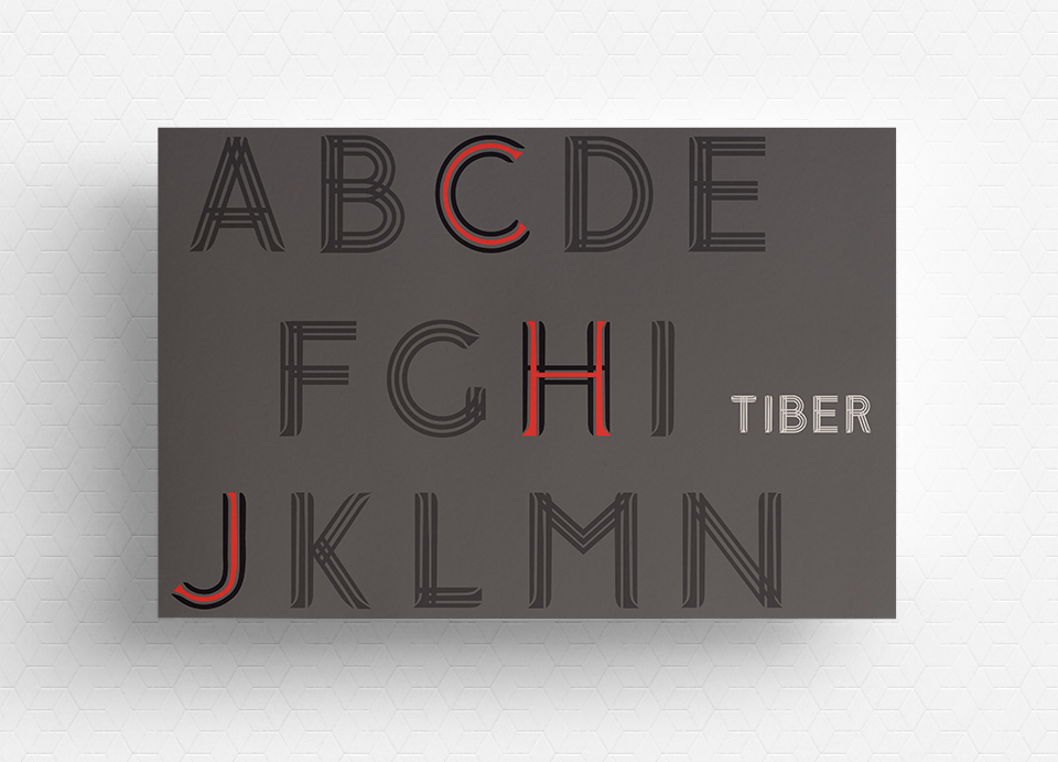
With the Imperial Roman serif and Fascist-era sans-serif, I wanted to create a visually arresting typeface–one that came from stone, but was entirely unique and modern. It mattered to create a style that would represent a modern Rome, but reflect the city’s history. I was particularly fascinated by the combination of a serif and sans-serif and the technical challenges presented by mixing one style with the absence of that style.
The result is a striking serif-sans typeface perfectly suited the bold expression of art, identity and communication that dominate our modern public displays (posters, signage, billboards, commercials, web sites, pop-up ads). Seeing Tiber as a headline on a bus stop ad would have a similar command of attention that the original inscriptions did, though that ad would be visible for only a tiny fraction of the time.

