Silkscreened Gig Posters
Hear and See the Music
My process for creating these silkscreened gig posters centers on three main design considerations. First, I want the music to be heard and seen through the design. For me, a poster is only successful when the band and the music is truly represented — otherwise, it’s more the designer’s poster than the band’s.
Experiment with the Design
The band’s music helps to give a direction, but, secondly, I always try to experiment with a technique, style or visual reference I haven’t executed before. These posters always present a unique challenge, because there are no limits to the design. It’s up to the designer to narrow the focus.
For the Audience
And third, it’s always important to me to consider who will be engaging with this poster. I want to create something that reflects the music, but also is something that will connect with the fans and draw attention to the show for those who aren’t familiar with the band. My goal is to design a poster that seems like it was made in the same language as the music.

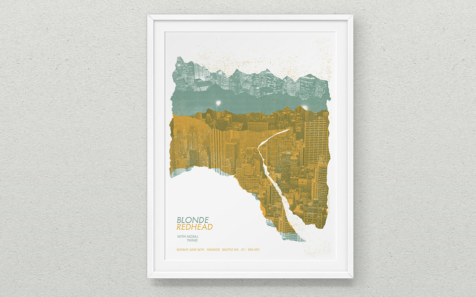
My first poster was Blonde Redhead, done as part of the Design for the Music Industry class at the School of Visual Concepts. It was used to promote the concert and sold at the show. In the poster, I was able to explore creating a landscape from city images, an idea I’d wanted to play with for some time. The band’s music influenced my choice of colors: it’s moody, ethereal, electronic-based music, and I wanted to express that moodiness through lighter tones.

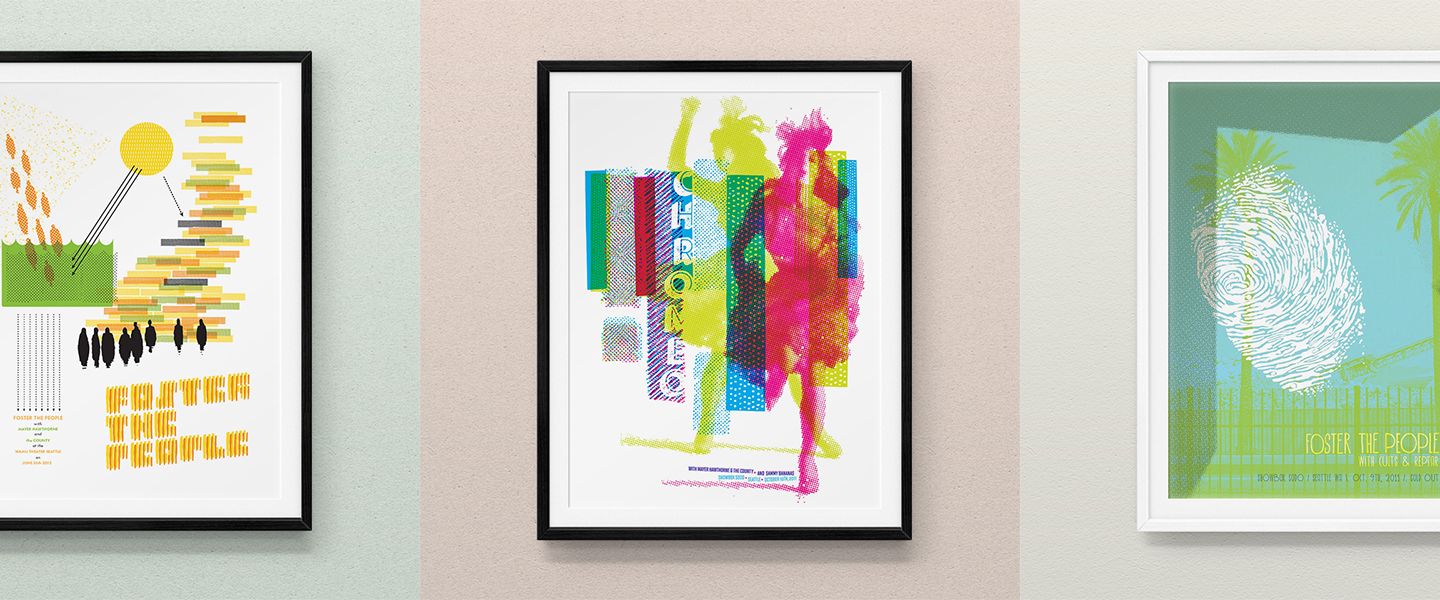
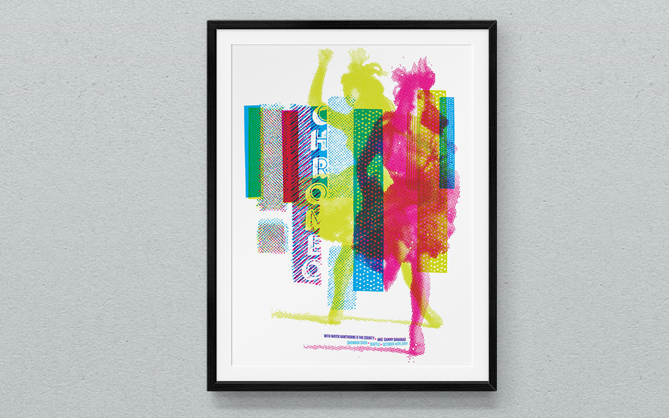
For Chromeo, I knew I wanted to experiment with a 4-color, CMYK print. The band’s music is fun, dance, electronic—and an icon of Chromeo is their electric keyboard set on a piano stand with two female legs in high heels. I found inspiration in photos of a dancing woman on a 1960’s Sandy Nelson record that I owned, and scanned/illustrated a number of different geometric patterns. The headline type is composed of vintage, metal letterpress letters that I inked, scanned and digitized. The textured blocks hint at piano keys, and the dancing women refer to the piano stand legs.

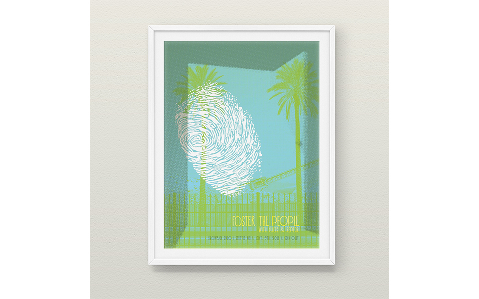
The first Foster the People poster was a visual collage of scanned and drawn elements — the fingerprint is my thumb, with the ridges redrawn to be figures. There is an expressive darkness in the music of the band, and that’s represented by the fingerprint figures superimposed on the open door, construction cranes behind. These elements create a tension that reflects the music.

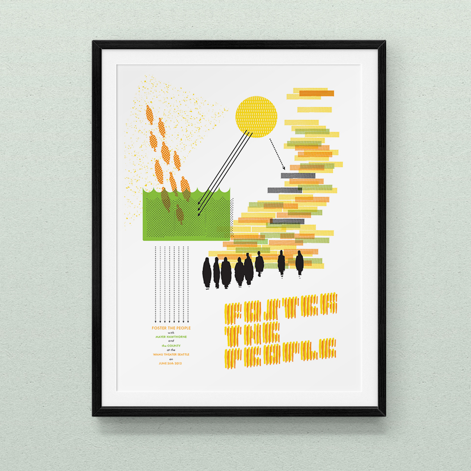
The second poster is a concept, which wasn’t used by the venue. The idea behind this poster was to visually reference mid-century science textbooks and graphics. This featured hand-drawn typography. I still love this poster!

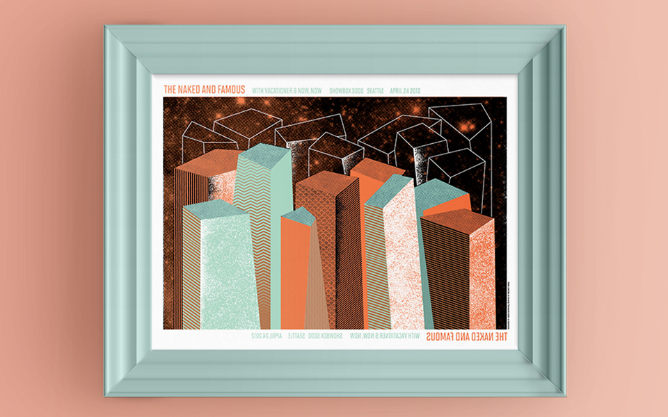
I’m also curious how light influences color, and for the Naked and Famous poster, I experimented with printing on translucent paper. I wanted a design that worked from both sides of the paper, and how adding the element of light would work with a screenprinted poster. It required a bit of testing to find the right paper (which would hold three layers of ink, retain translucency, but also be durable). The result was a beautiful poster that was vibrant and strong on the printed side, and much more expressive and sentimental when the reverse side was backlit.

